Industry
Education
Client
Green English (Taiwan)
My Role
UIUX / Website Development
Timeline
2024/12-2025/2
Green English-Key to the word
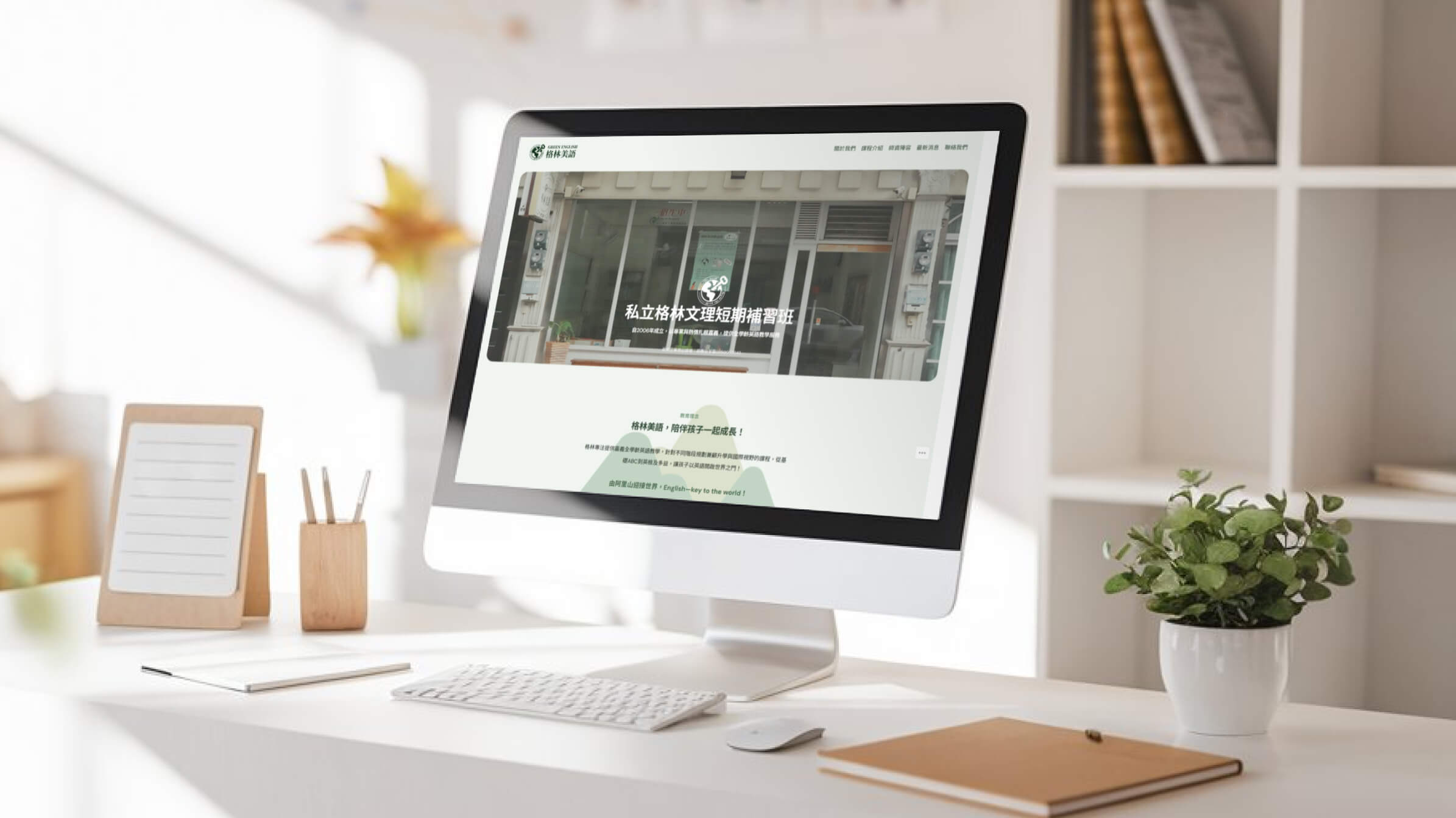
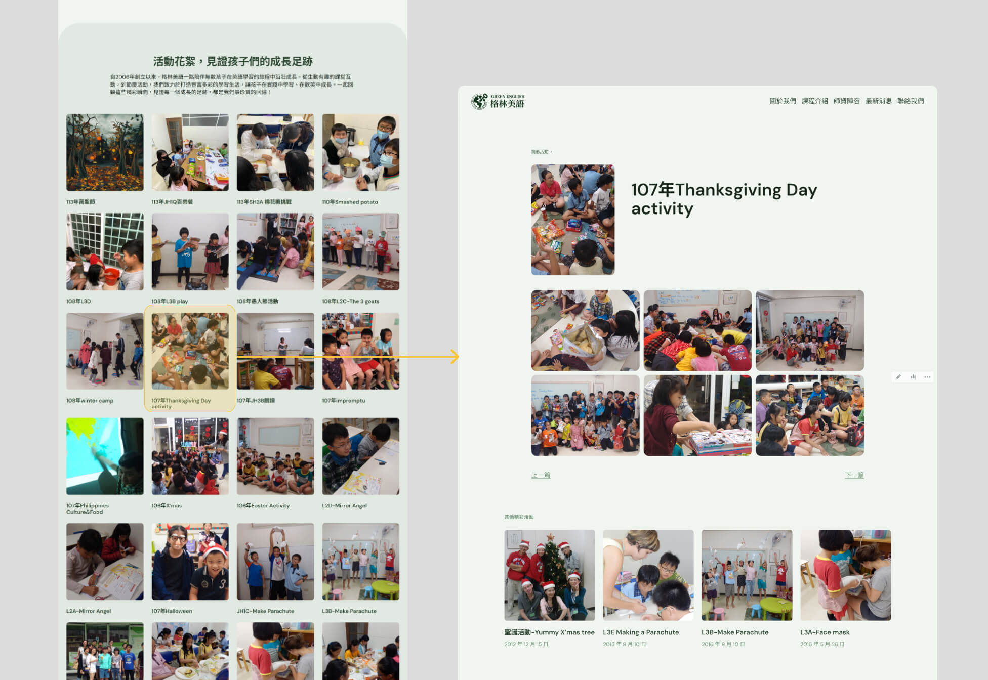
Green English, a trusted education brand for nearly 20 years in Chiayi. I refined the brand vision and designed a WordPress website with CMS functionality, enabling easy updates. The site connects students, parents, and the institute, providing curriculum details, activity updates, and a gallery for past events.
Overview
Challenge
Defining a Unique Identity for a Small Educational Brand
Solution
A Warm, Brand-Focused Web Identity
Feature1
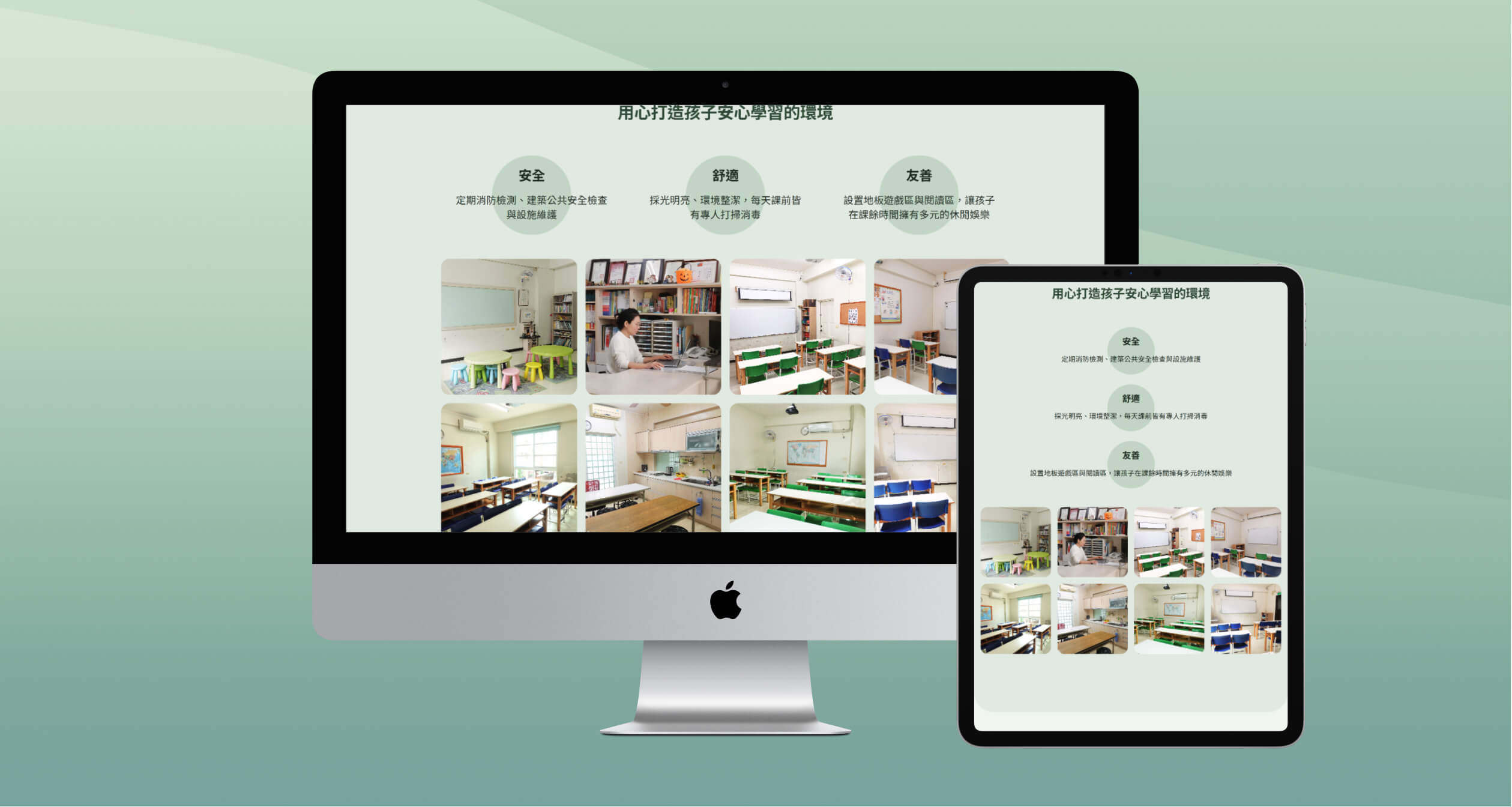
Brand Oriented Web Design
Using the brand’s signature green to reinforce its identity. A user-friendly layout ensures easy navigation, helping expand reach beyond local referrals while maintaining an approachable and trustworthy appearance.

Feature2
Highlighting Growth-Centered Approach
Created a brand identity and website design that emphasize children’s development, differentiating Green English from exam-focused competitors.
Feature3
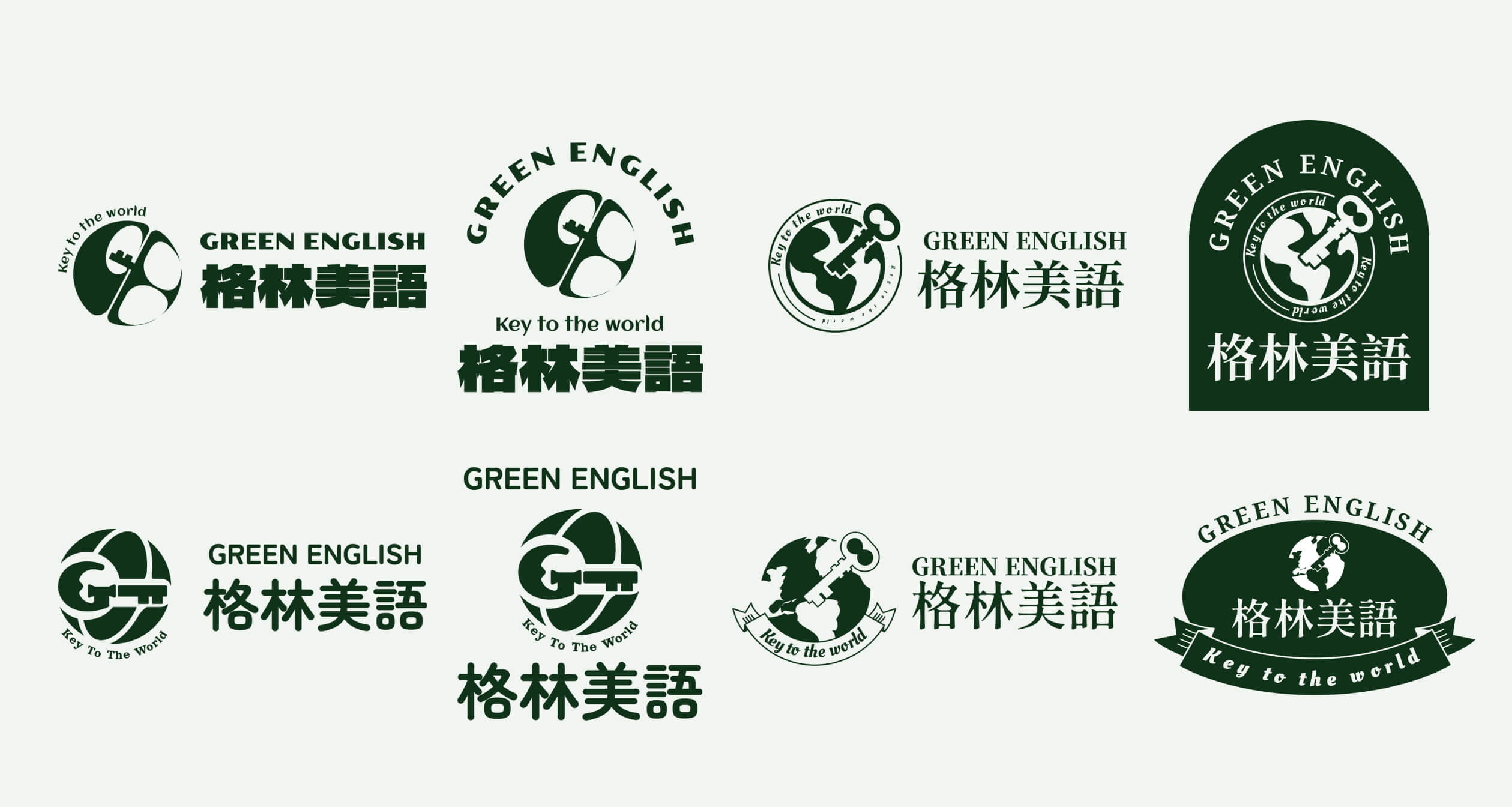
Logo Redesign & Print Materials
Revamped the brand logo and applied the refreshed identity to various print materials, ensuring a unified and professional visual presence across all platforms.

Research
Competitive Research & Analysis
Conducted a thorough analysis of competitors, including both traditional and online educational institutions, to evaluate their website design styles, structures, and user flows. Based on this research, I developed a comprehensive sitemap, ensuring our website aligns with best practices while maintaining a unique identity for Green English.

Visual Style Definition & Brand Identity Research
I developed four distinct logo concepts, each representing a different aspect of Green English’s identity. The client chose the design that best captured their nurturing, community-focused approach.
Initial Wireframe Refinement & Later Feasibility
I extended brand colors into the wireframe to create a lively feel but found the heavy tones visually overwhelming. Development constraints in WordPress further limited design flexibility, leading me to refine the layout for better balance and usability.